Our typography is just as fresh as we are. It's easy to read and is designed for maximum
The primary font for all communications is Antique Olive Nord D. Like swiping right on Tinder, it should be used sparingly for headings and one-liners. Aktiv Grotesk Ex is the font you'll use for body copy.
Antique Olive Nord D
Used sparingly for headings and one-liners
Aktiv Grotesk Ex
Body copy
Hierarchy
To ensure hierarchy of messaging is clear in all media, the text must be relative to the body copy (where the default size is 16px)
For other applications, the font size usage is more lenient, and your creativity is encouraged. However, please remain within the guidelines.
Pairings
Headlines are always paired with a regular weight sub header. Regular weight headers will be paired with regular weight sub headers. Where small bold weight headers are required, a lightweight text will be used for the body copy.
Headliners paired with regular weight
Regular weight headers paired with regular weight sub headers
Small bold weight headers paired with light weight body content
CTAs
We want to engage our audience and get them to click for more. To make sure our call to actions are clearly visible and clickable, this is how they should look.
Inactive CTA
Hover CTA
Inactive Button
Hover Button
Imagery
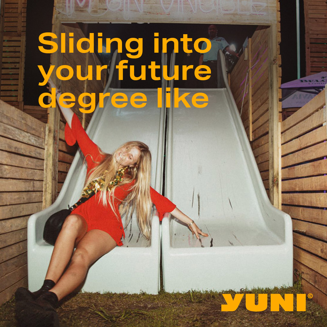
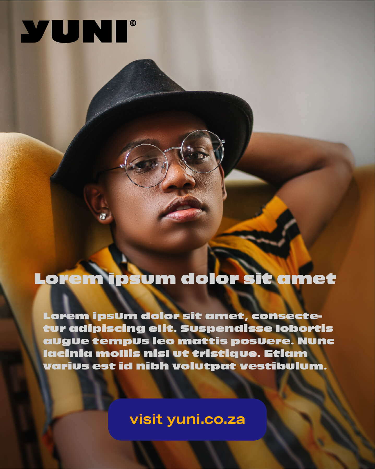
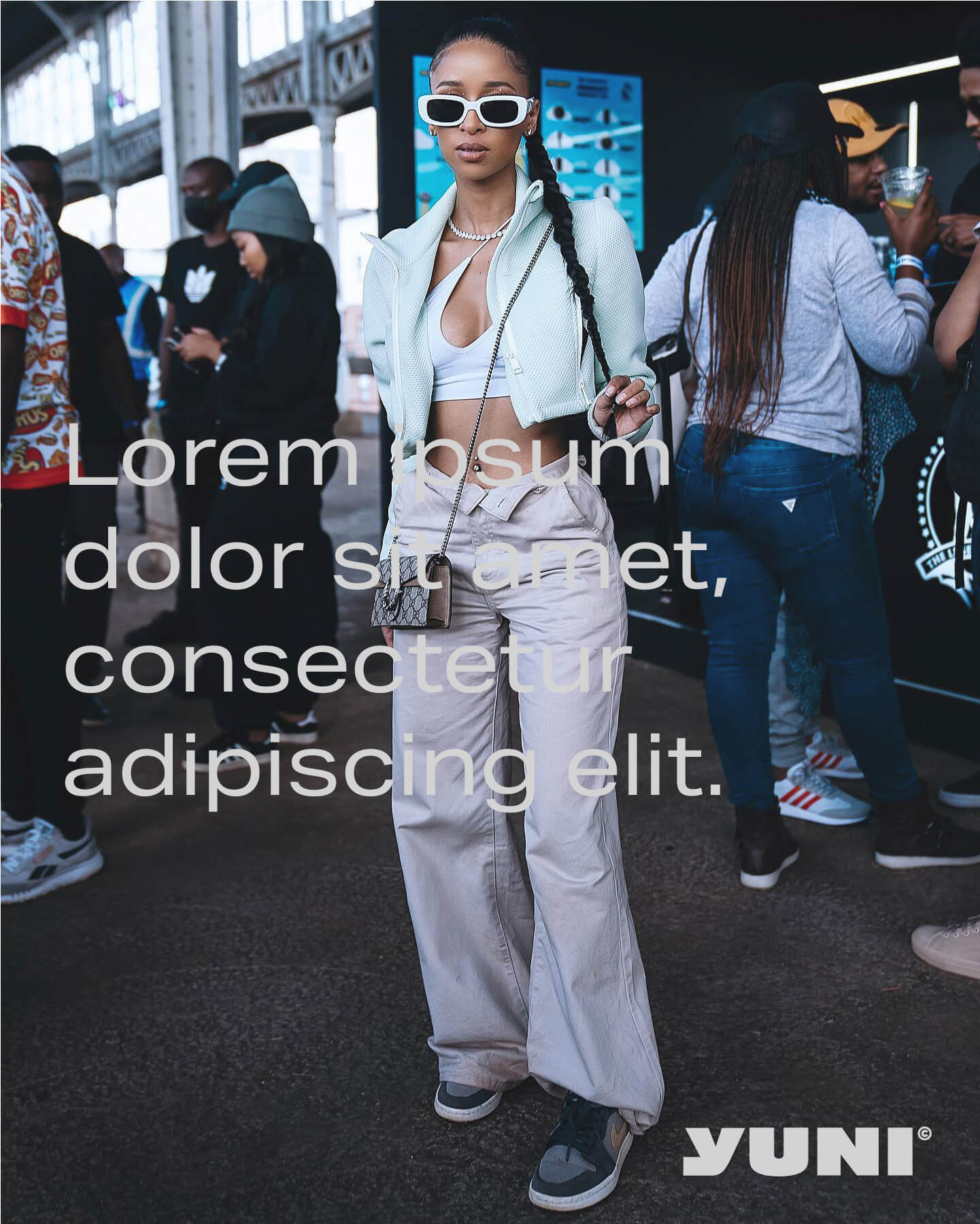
To make some creative pieces that are all hits no misses, it's important that the text sits comfortably on the image. That's why the copy is placed in a clear space on the image and the colours used must be high contrast.
Typography is placed on non busy backgrounds with high contrast
Guidance
A cohesive brand means that we all need to stick to the rules. To make sure we're all vibing to the same tune, here's what you shouldn't do:
Don't use different fonts
Don't pair low contrast colours
Don't use Antique Olive Nord D for body text
Don't place text over busy backgrounds
Applications
Applying the fonts to different applications is simple. Just take a look at the examples below and it's Gucci