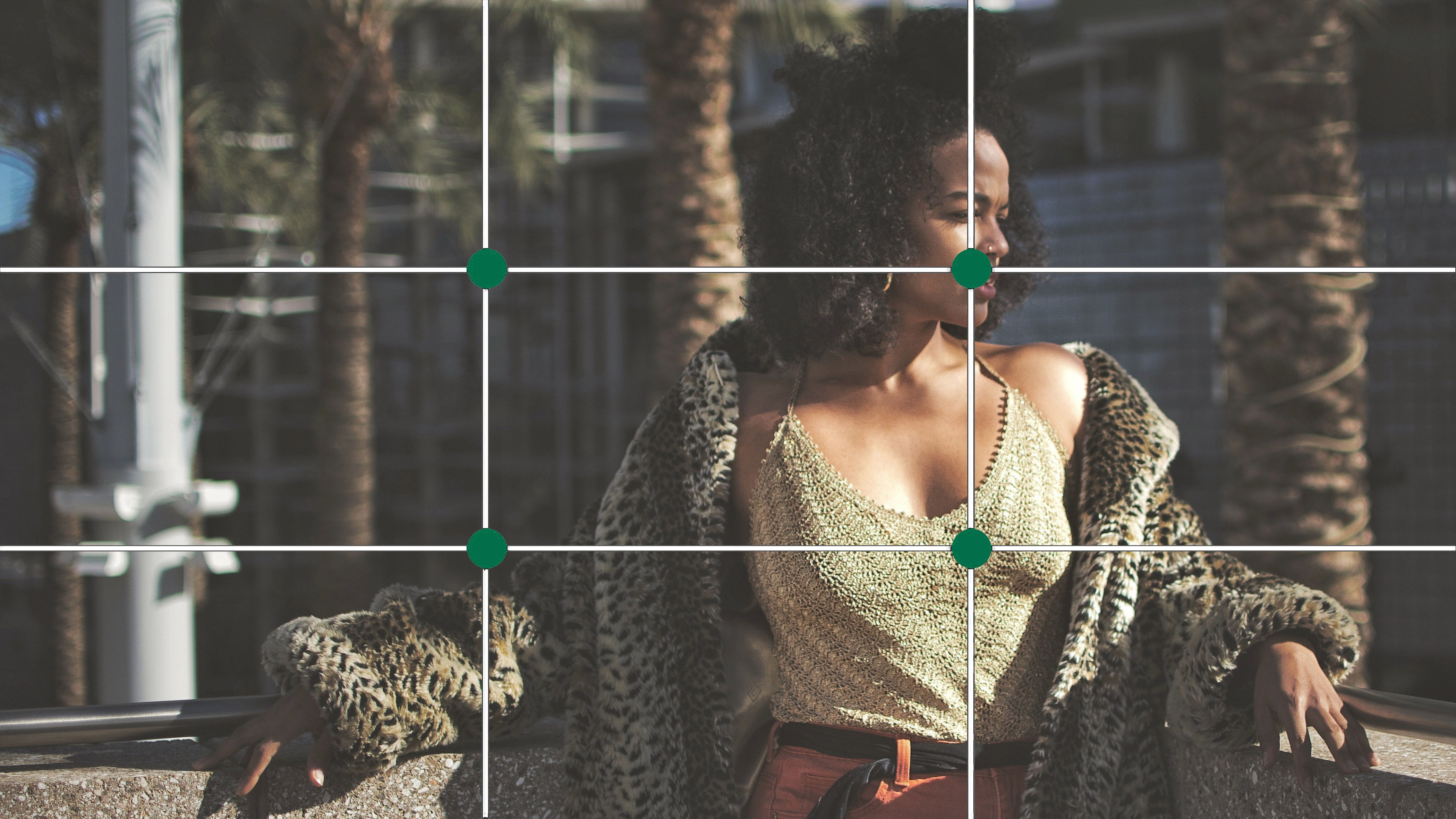
This rule is best used for website banners and landscape applications as it allows space for text and call to action buttons.
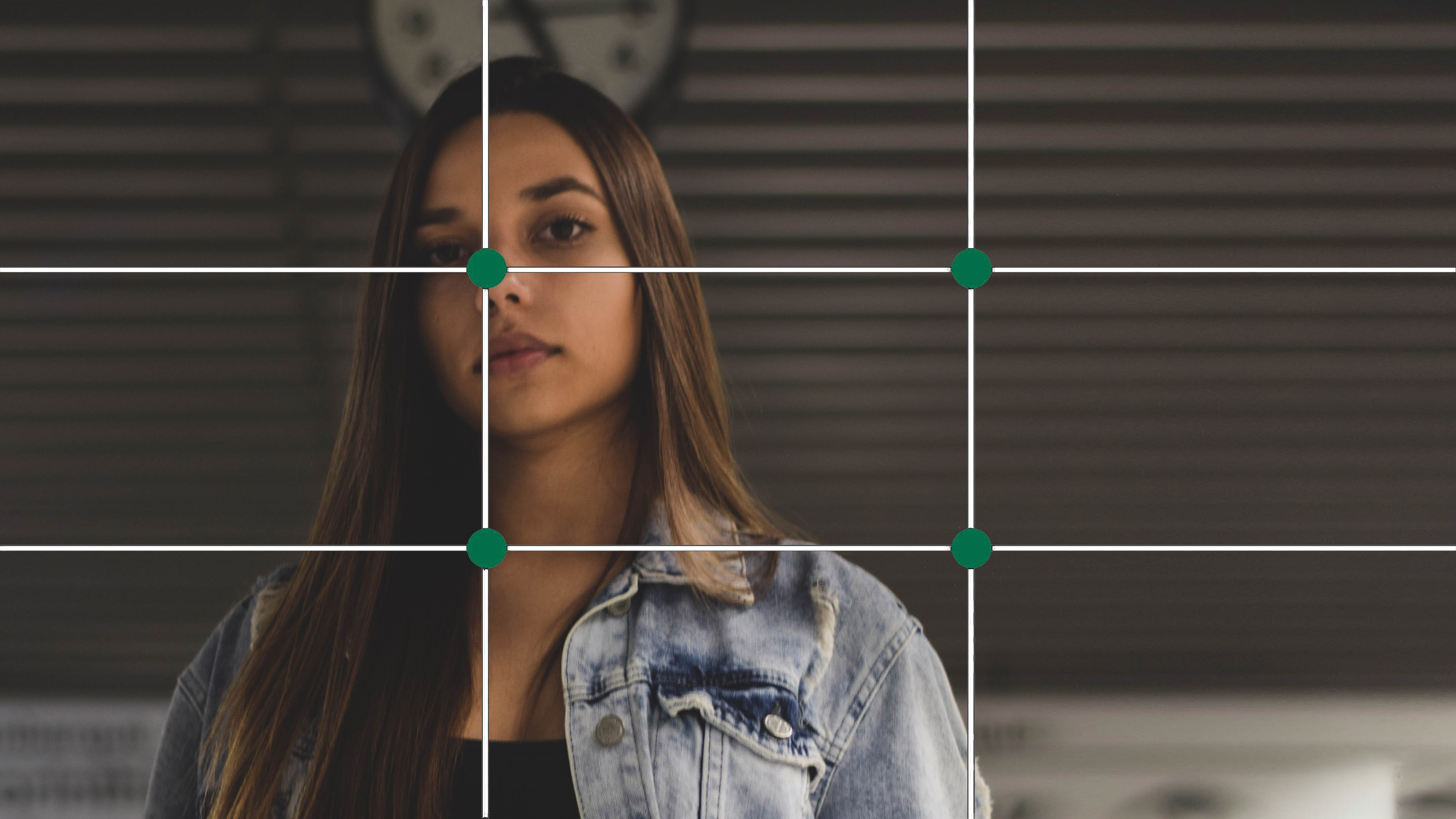
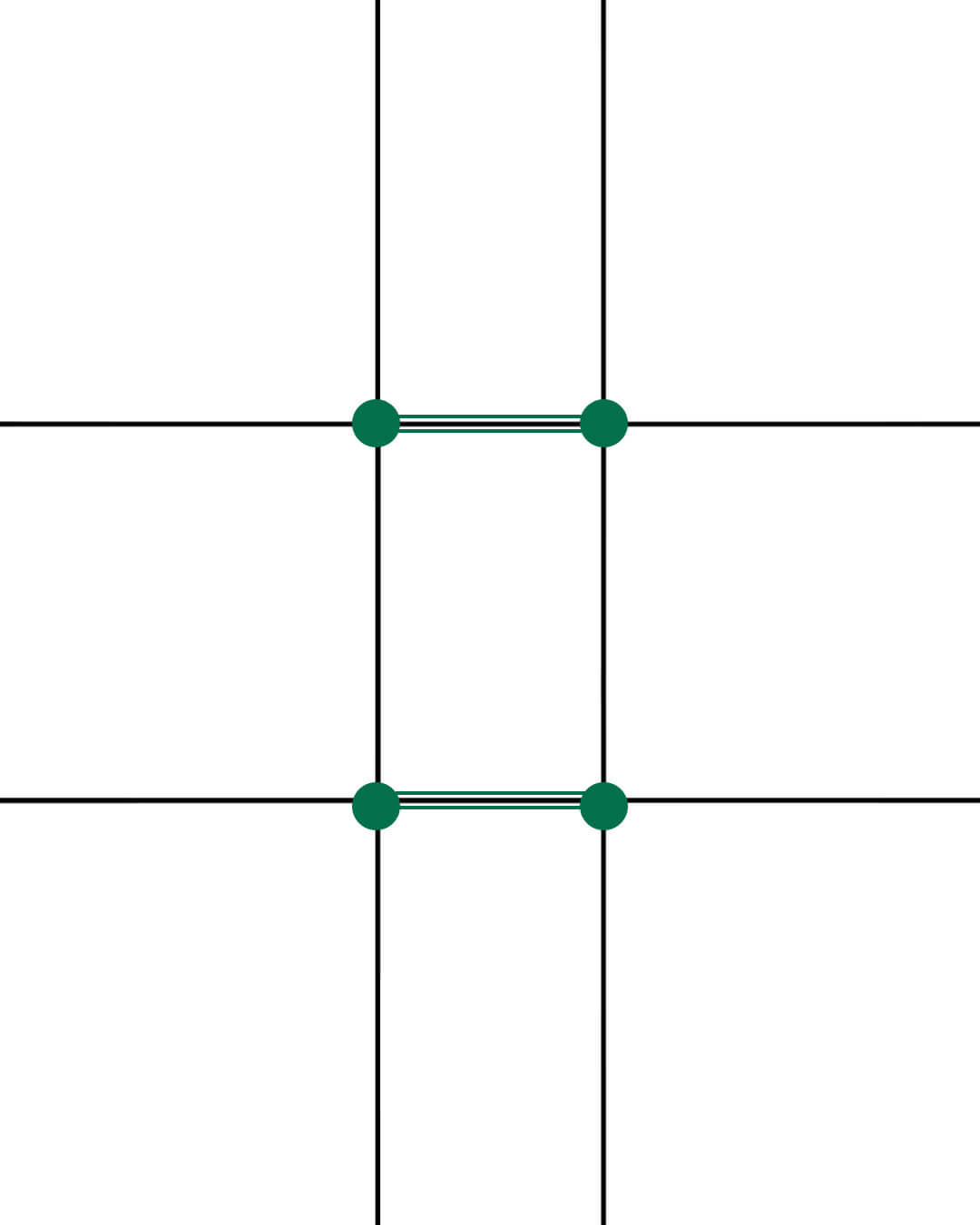
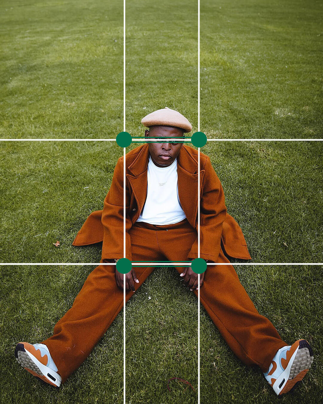
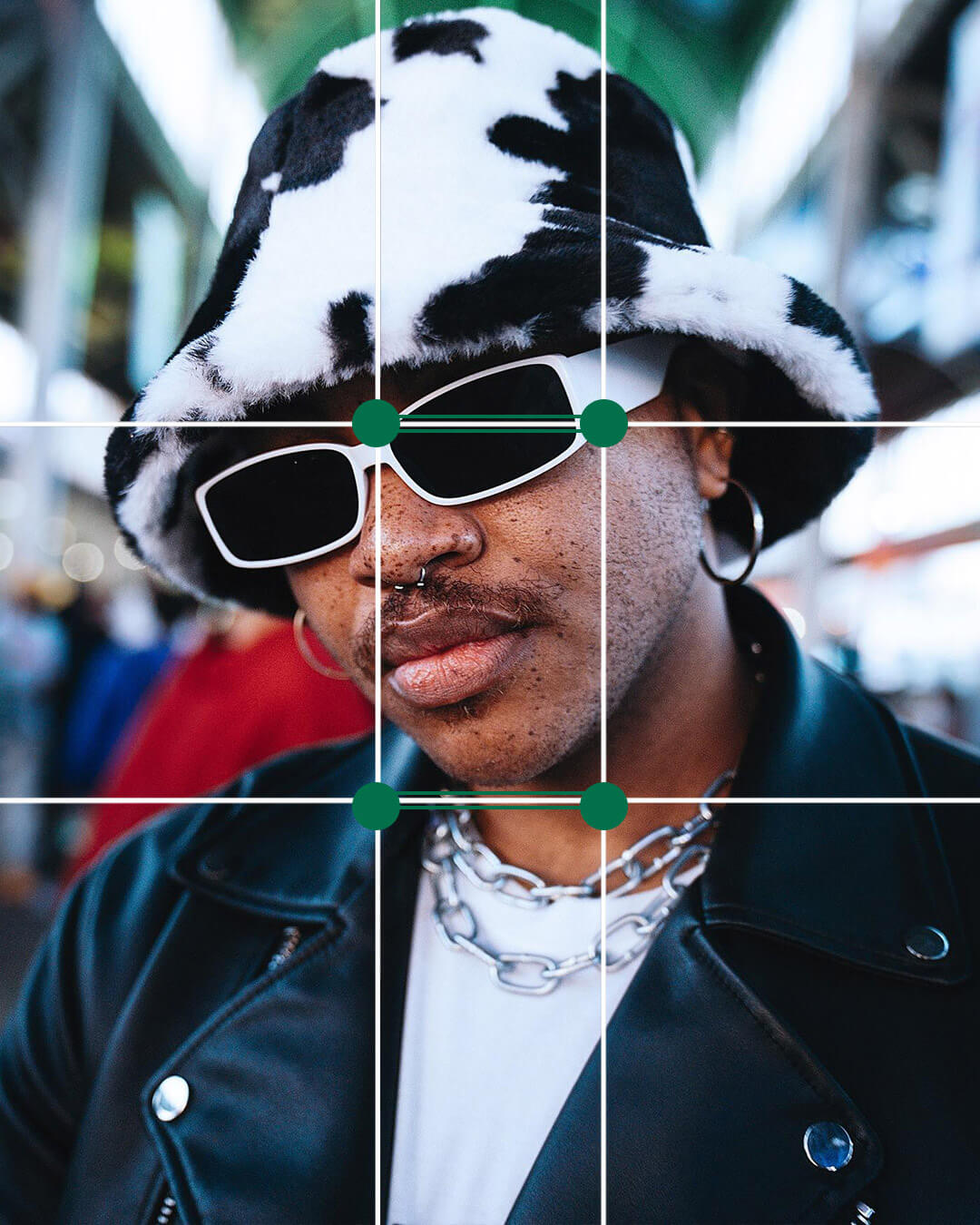
Using this method, the subject is located a bit more central, which works better for a vertical composition. When used in social media, it allows for a better thumbnail crop and also looks good when expanded.


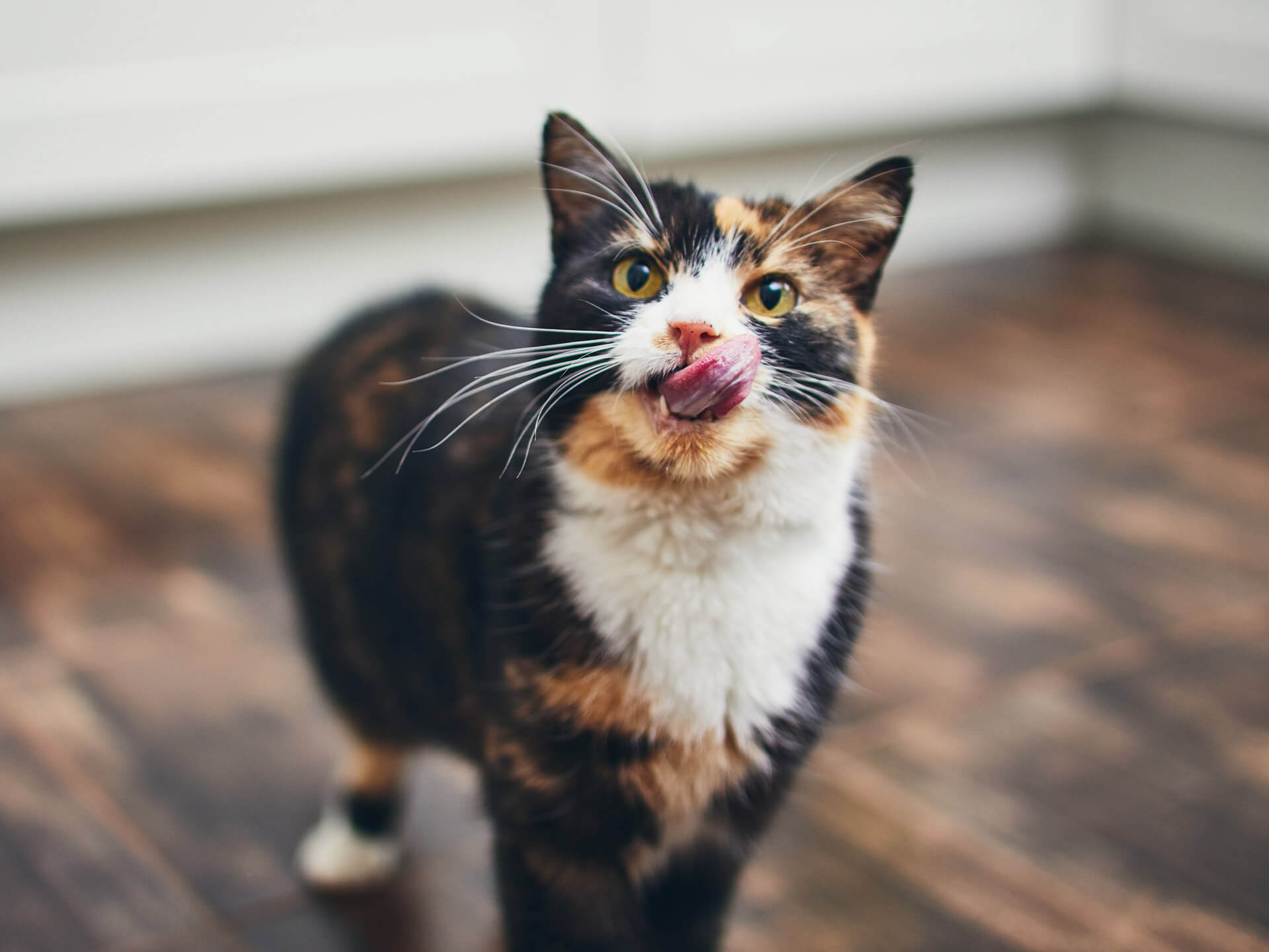
Need we say more?


To avoid this, stick to the composition rules and you can't go wrong.


With the exception of memes, content must be relevant, fresh and relatable.